

Developing Geonotes — Initial UI revamp — Ep. 8
With the basic functionality in place, it's time to give the pages some structure.


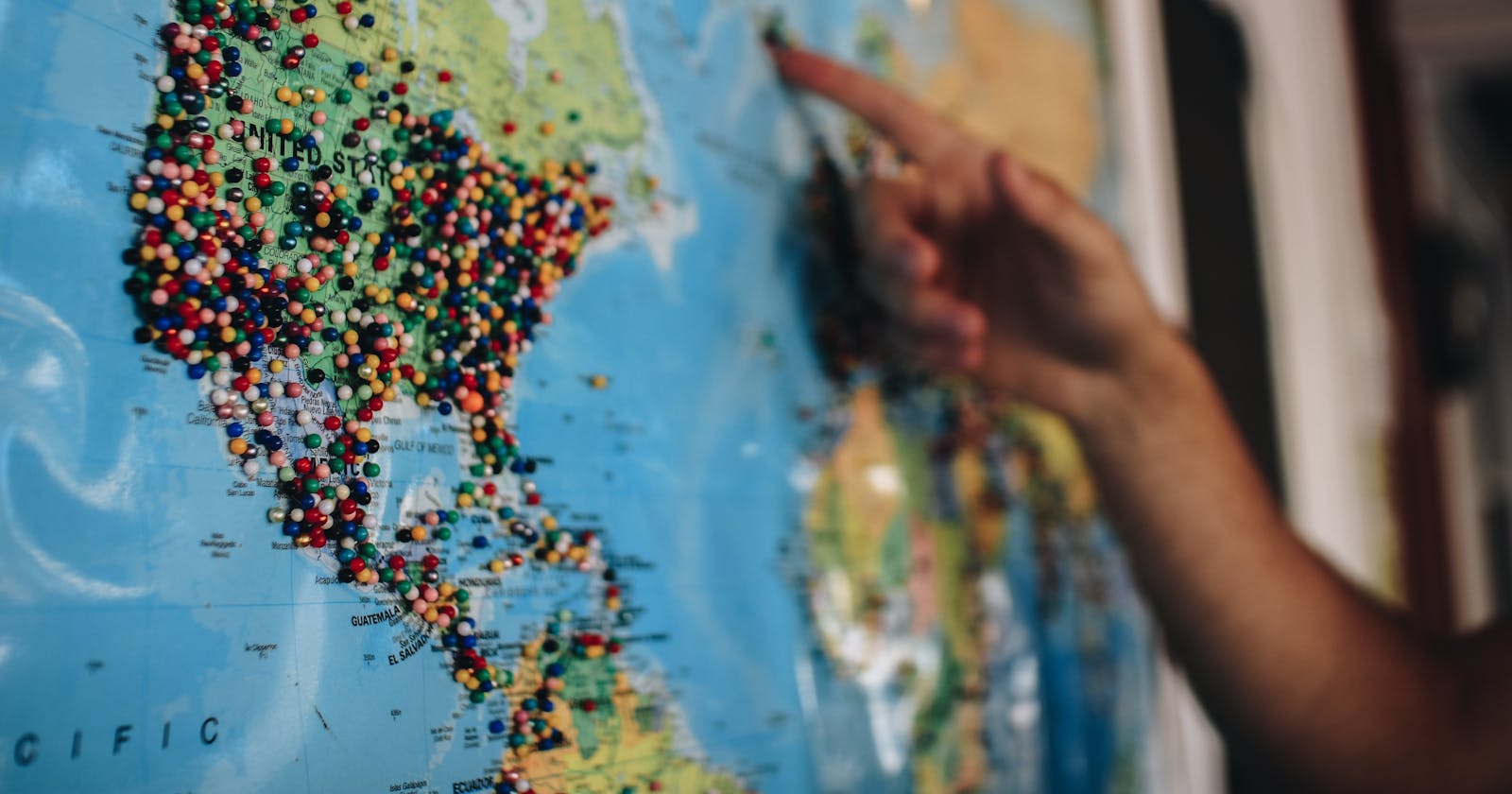
I am not a graphic designer by any means, but I think it is easier to work on a project when it is somewhat visually pleasing.
After completing the various basic functionalities, I started creating a few basic components to give the app a more coherent look.
🎨 A new default look
The first obvious missing elements were icons for the tabs and buttons. Since I'm using Expo, I have access to a set of vector icons. In the final version I'll need to make and import some custom SVGs, but for now the out of the box icons are more than enough.
Here's the set of available icons. I chose to use "Ionicons" ones, since they have a good variety and I like the style.
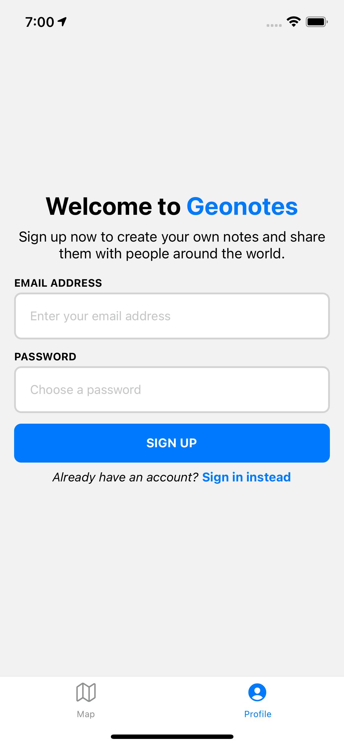
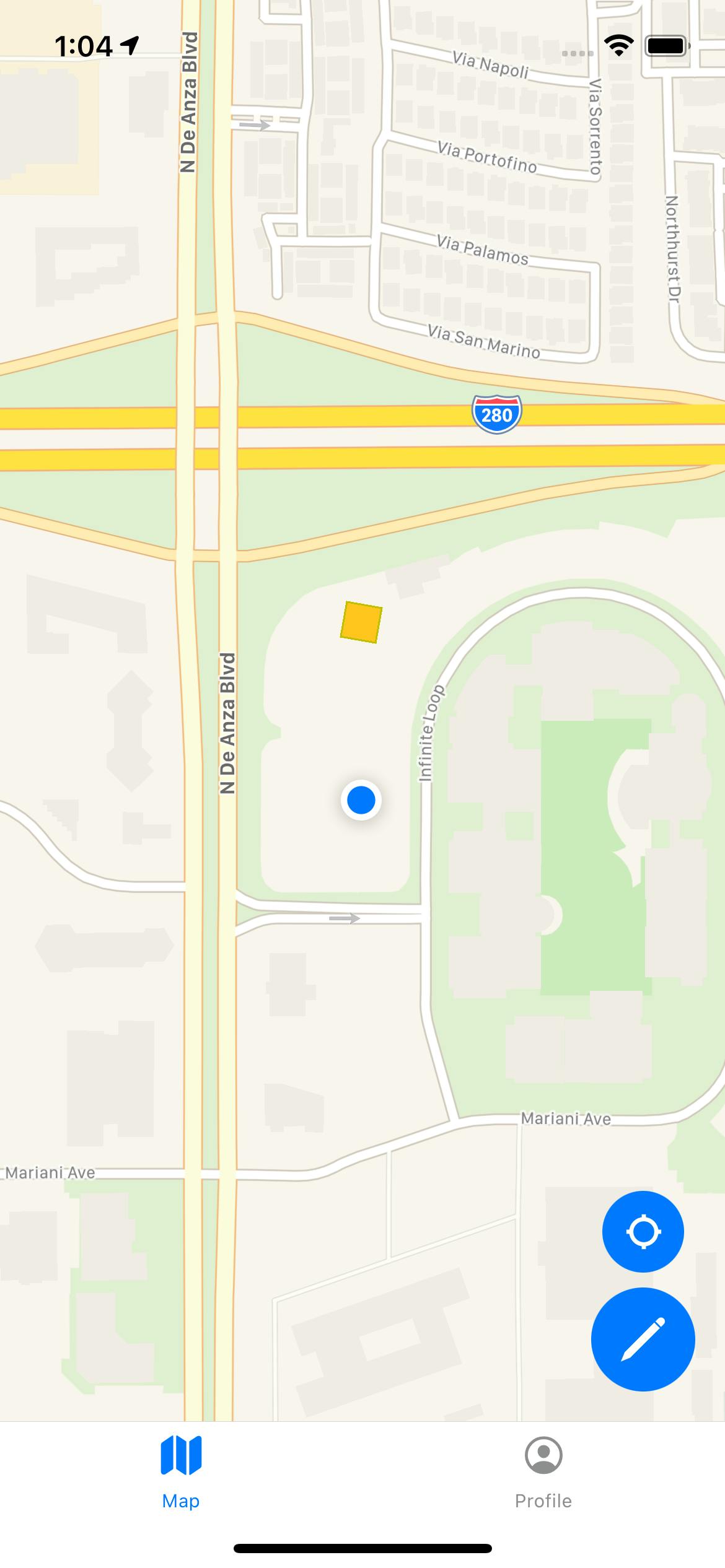
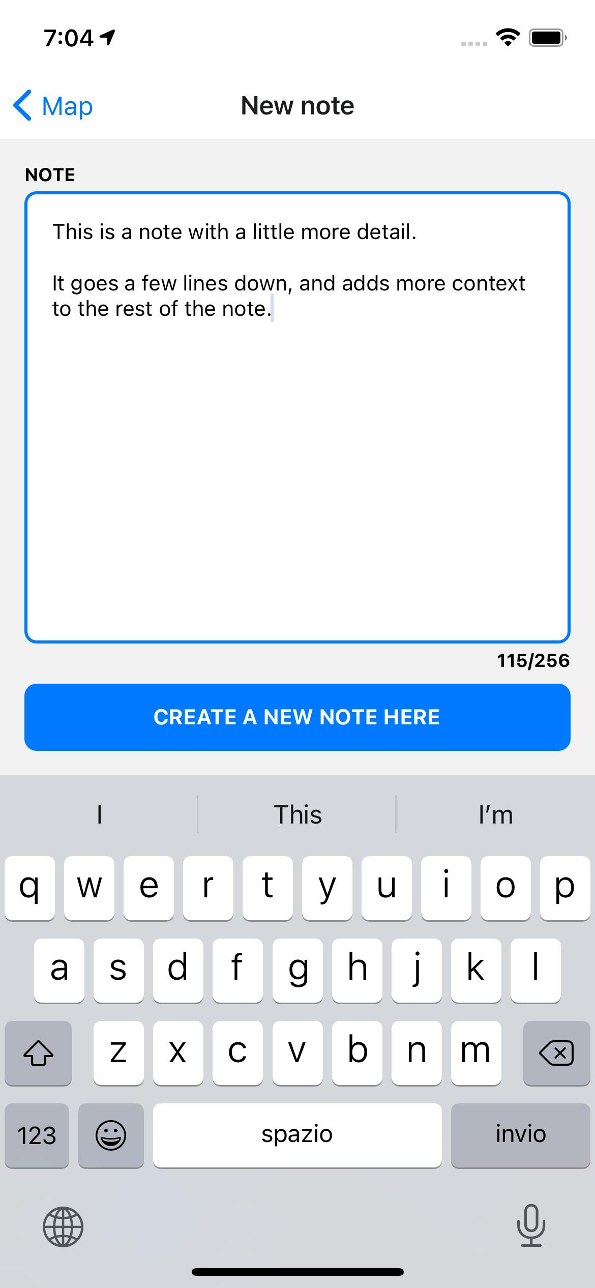
All base components now dynamically adapt to the primary color, which is kept consistent by setting it as a property of the navigator theme. I went with a classic electric blue look.
Standardizing basic components like text, buttons and text inputs guarantees that all screens feel consistent and coherent. I used rounded corners and borders to give a smooth and modern look to the application.
⭐️ The result
The application now looks less work-in-progress and a bit more polished. Just in time for some internal tests I want to do with friends and family.
Here's a few screenshots:
| Sign up | Map | New note |
 |  |  |
🚧 Next steps
Now that the app is more presentable, I want to work on tightening the direct access control to the database by mediating it through cloud functions.
After that, I'd like to add more functionality to the profile screen like a way to view your notes' statistics.
🎙 How to follow the project
I'll be posting updates throughout the development process and as I learn new thing regarding development, design, and marketing.
If you'd like to have even more real-time updates you can
- Follow me on Twitter @emilioschepis
- Checkout the public GitHub app repository and backend repository